
Magazine Apps
Condé Nast UK
The business asked us to create responsive HTML apps for the magazine content for all the Conde Nast brands, to go out each month with the issue. It made sense to come up with a flexible framework that could adapt to each brand.
Starting with Glamour Magazine, we wanted a way for users to read the magazine on mobile, keeping the feel of flicking through a magazine, but within a clear and navigable structure, taking advantage of the fact they are on a touch device.
This was done using the concept of cards, every article has a “card” at the top which would give the reader the feel of the article and what type of content it contains. Kind of like glancing at a page in magazine to get a feel whether its a long editorial piece, a gallery, a fashion shoot. They could then either scroll down to read, swipe right to get to the next article and well as using the menu to navigate to any section or article in the entire issue.
Scrolling through the cards before choosing an article
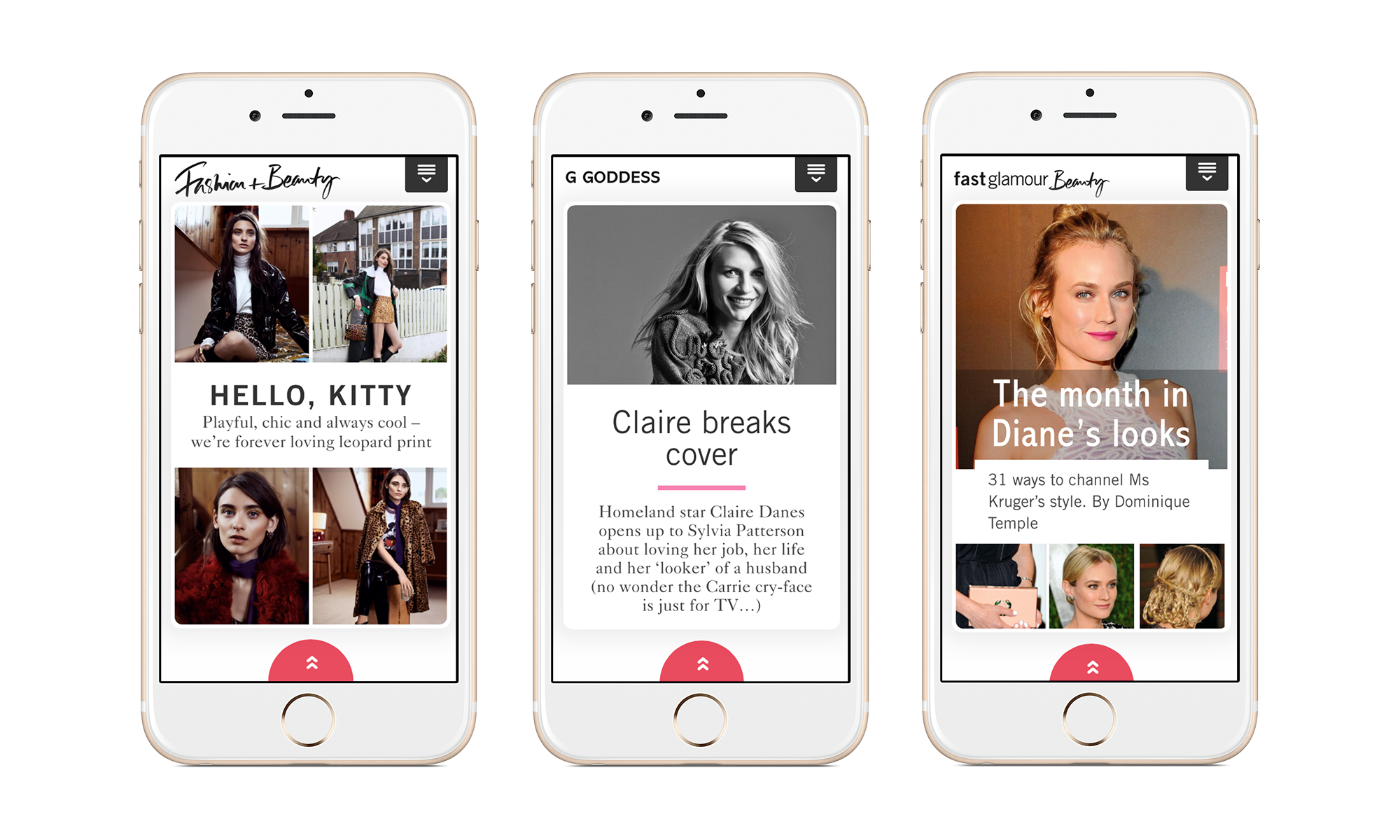
Different card types on the December issue of Glamour. Gallery card, article card, article with gallery card.
Design
Leading the design was an especially delicate process as the content is directly from the print magazine. The Art Director of the print magazine felt, as did other brands art directors, unsure about how a magazine layout could translate to a small device size. They were apprehensive that their layouts would lose the feel of the article or the brand. I worked carefully with the art director, making sure it was on brand and something they were proud of too. There was some convincing on our behalf to go with decisions that would enable responsive layouts and great usability but I think they enjoyed learning about digital design and we both ended up appreciating the difficulties in each other disciplines.
Using our gallery functionality worked perfectly with magazine content on the app
Typography
Wanting to completely capture the Glamour brand using typography, I created many different heading styles, quotes, notes, lists, and more to give the content team options to keep it as close as possible to the magazine, while still working as mobile content
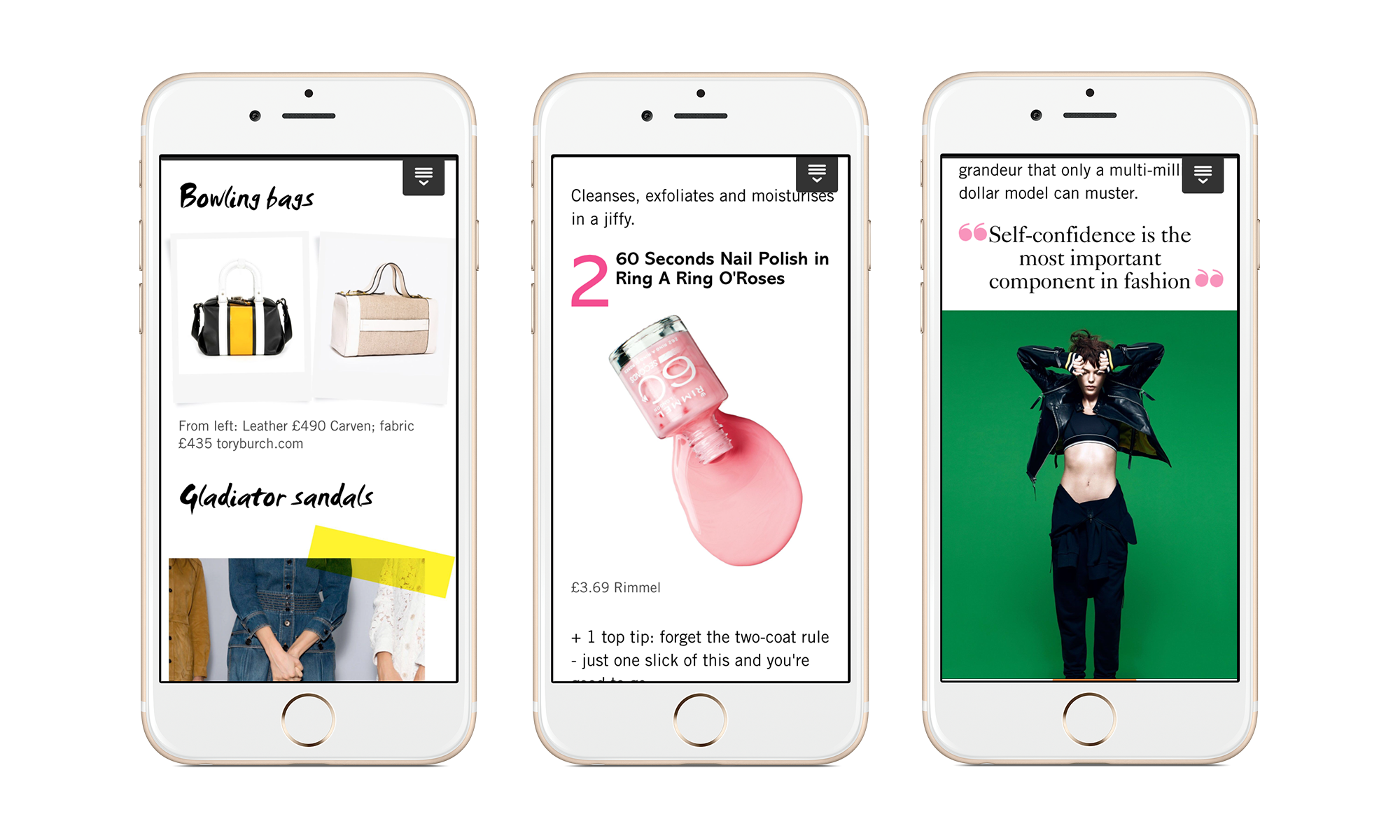
Typography styles on the Glamour Magazine App
Training
As this wasn't just a one-off app, the people putting in the content each month needed training to be able to use all the styles, images and functionality we built. I spent a lot of time with them, guiding them for the first issue and then creating instructional guide to ensure they could continue to input the content to the correct standard.
Shared functionality
We did a lot of work thinking of features and interactions that to view magazine style content on a mobile device. Some of these made it to the first edition and some may be in future releases. One of the concepts was what the user will see when they first open the app. The magazine team was pushing for an exact replica of the cover, where you would click on the cover lines to jump into the issue. We pushed back on this because firstly it would be a nightmare to create every month for each type of device and each different aspect ratio as this is a responsive app. Secondly you couldn't read them at that size on a mobile device. The cover stories were still important as that is what makes a reader pick up the magazine off the shelf and buy it. So we came up with the solution of having the cover lines as a list that scrolls on the first screen of the app, enabling the reader to click straight into a story or swipe right to begin reading from the start.
The initial screens on the Glamour and Vogue apps.